Ban Island - banisland.com
Tasks
UX Design | HTML | CSS
Summary
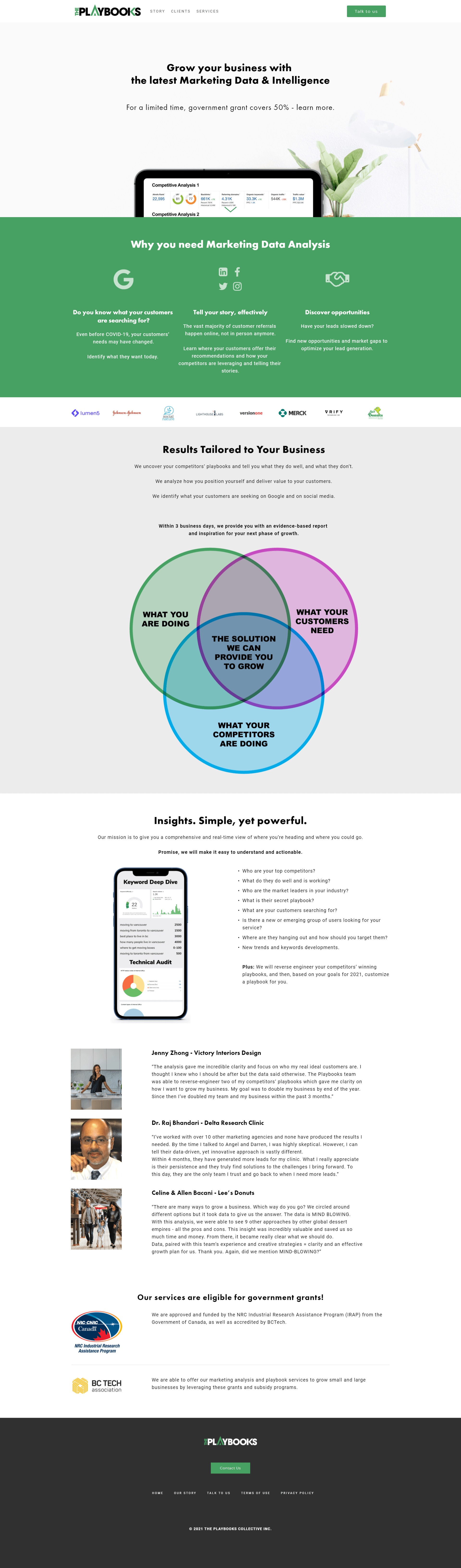
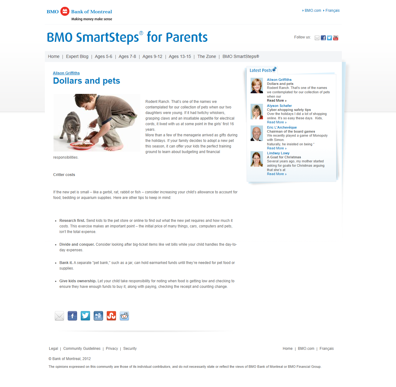
Ban Island is a website for luxury handbag enthusiasts to create different colour combinations of handbags they dream about, as well as connect with other enthusiasts and engage in mutual appreciation for a shared passion, or engage with the buyers and sellers market. All sellers are vetted and require endorsements from verified users.
This project is an amalgamation of various different systems such as the homepage feed, the messaging system, the personal collection, and custom visualiser. It was a challenge to develop and then connect these different features and systems into a user experience the end user could easily navigate through.
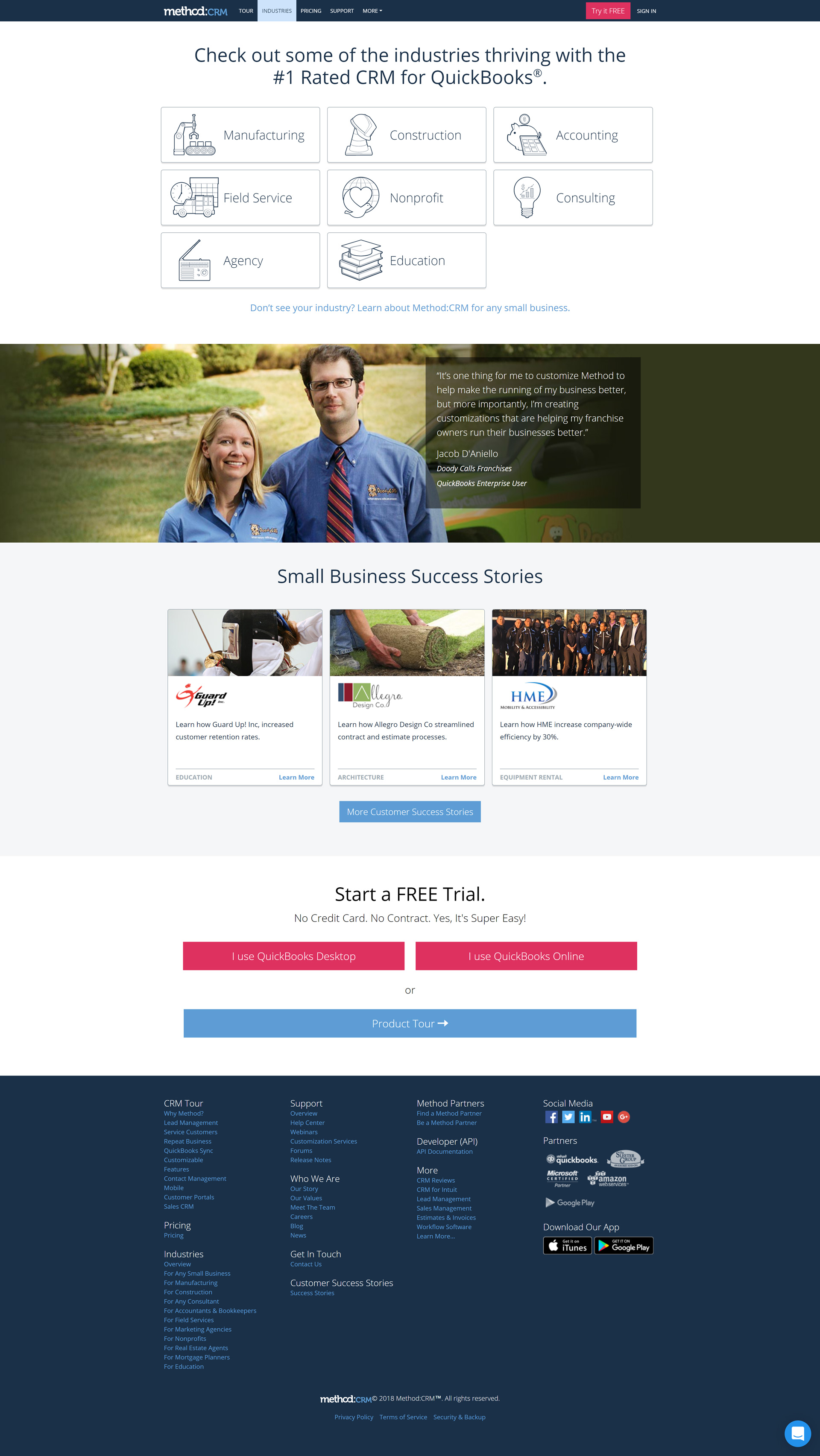
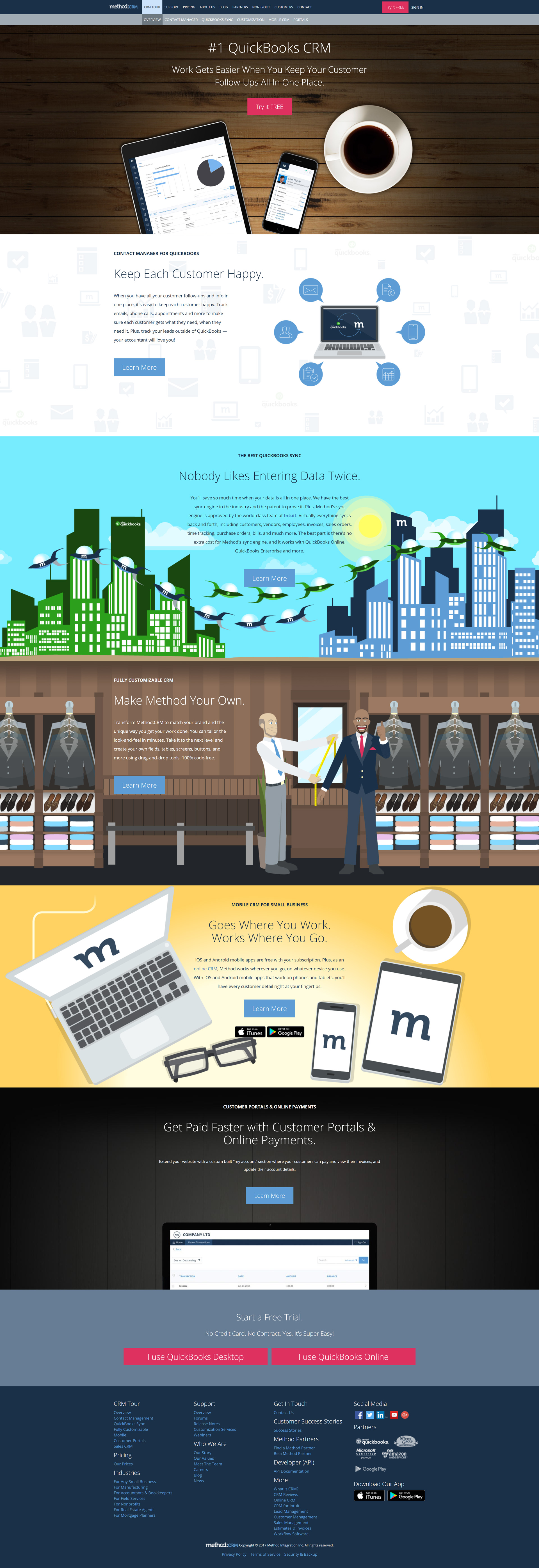
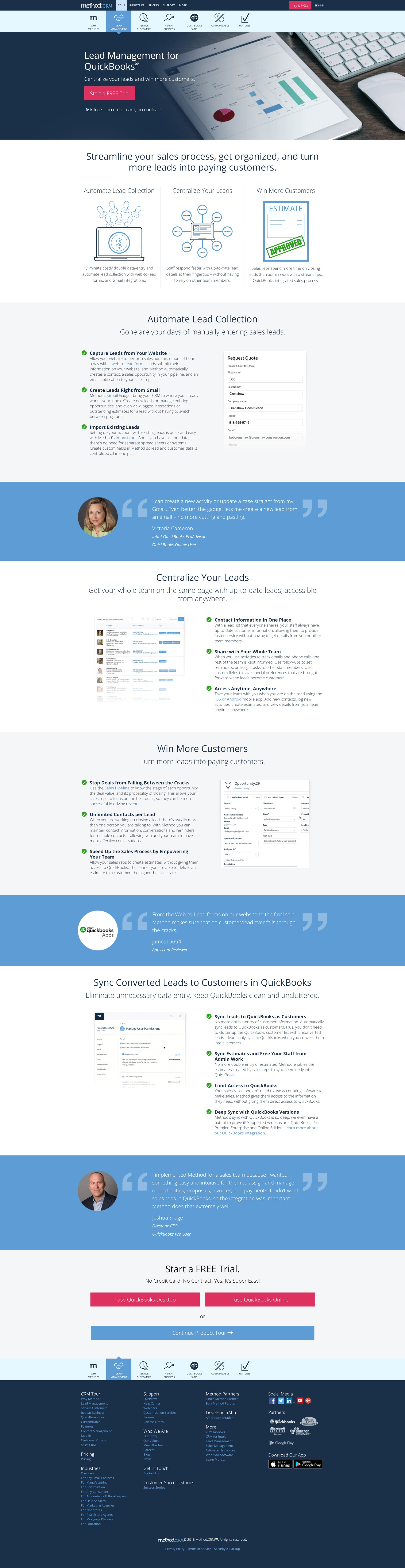
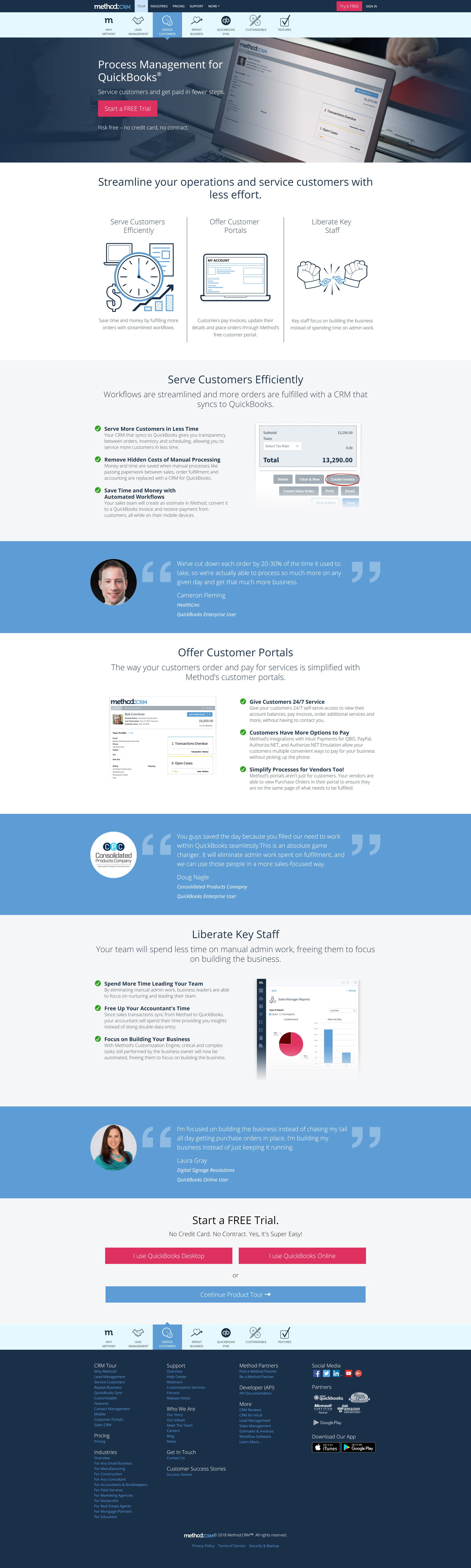
Featured Pages
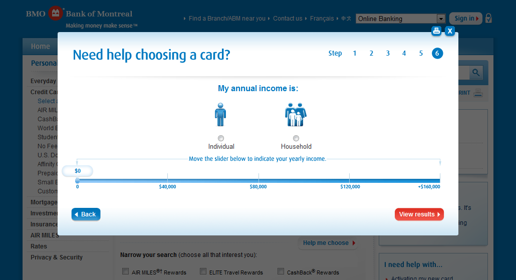
Benefits (Desktop)

Benefits (Mobile)
Influencer Program (Desktop)
Influencer Program (Mobile)
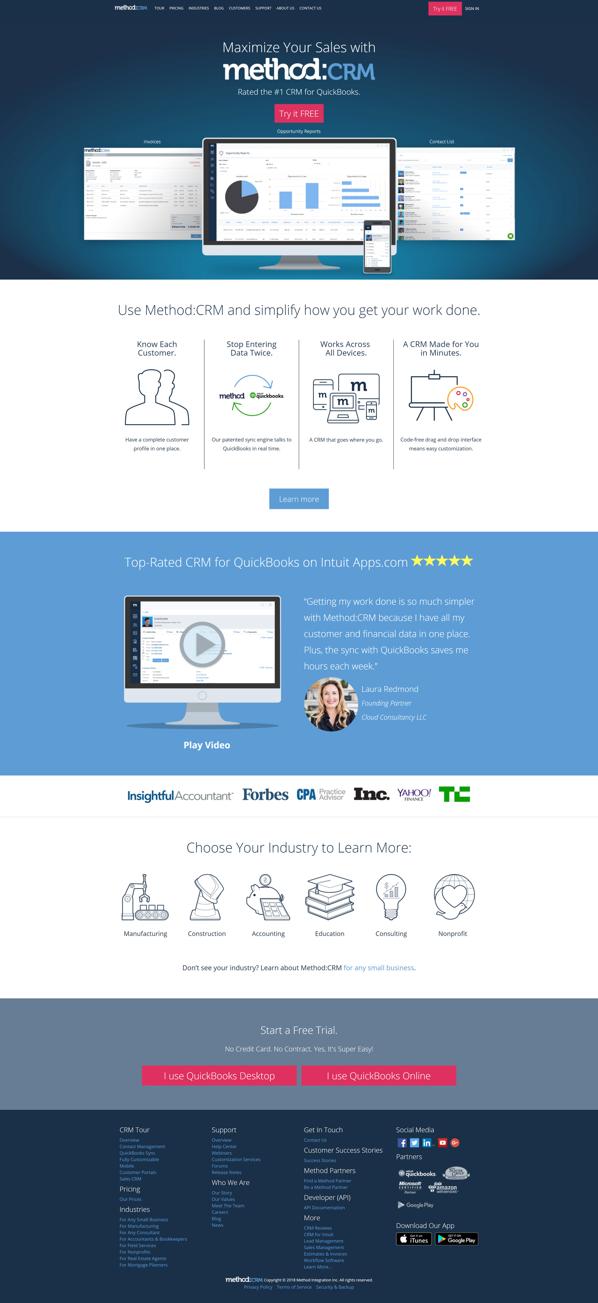
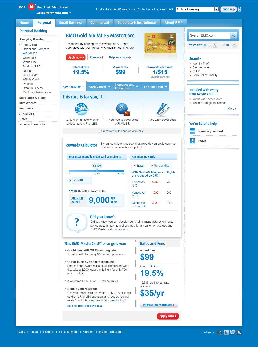
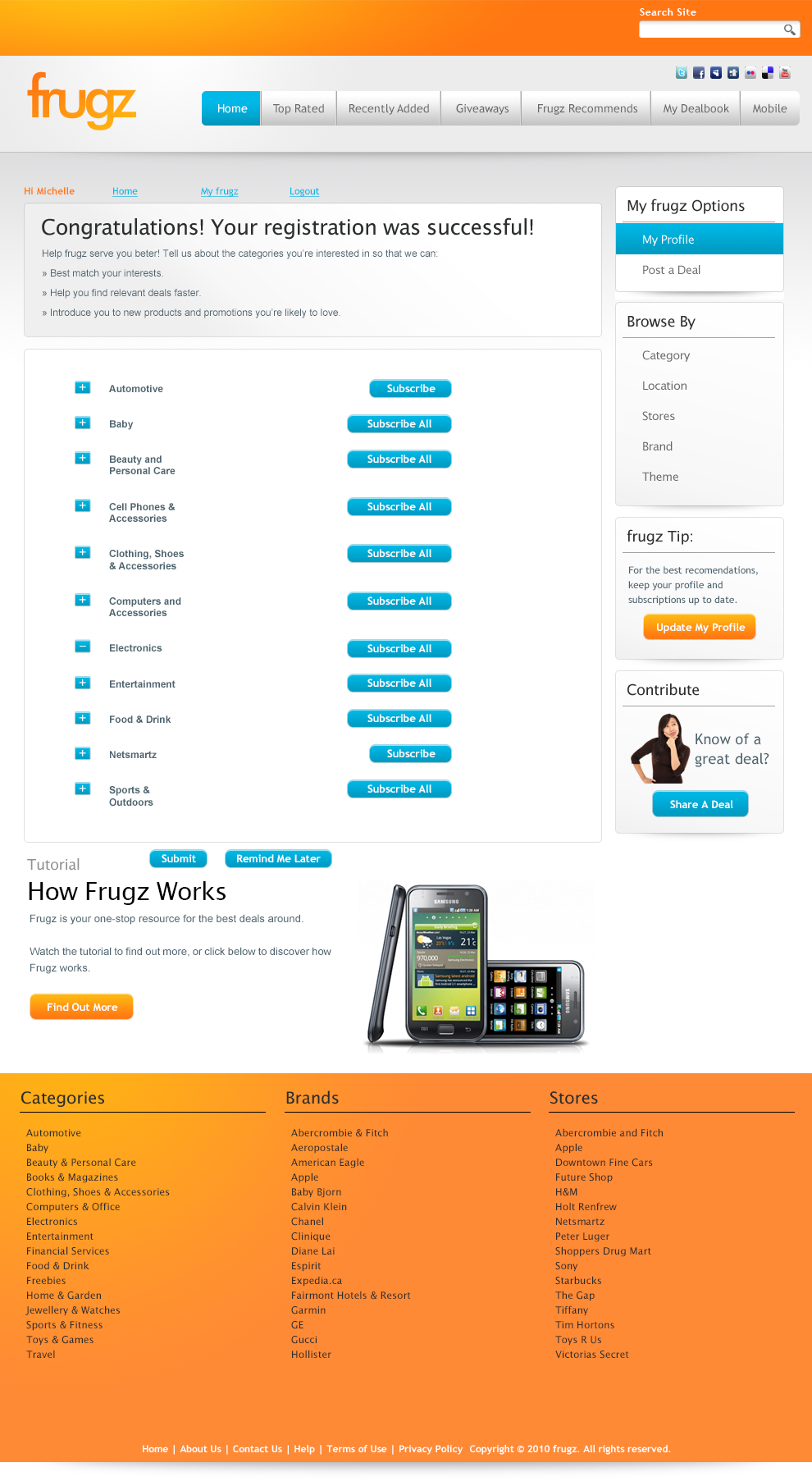
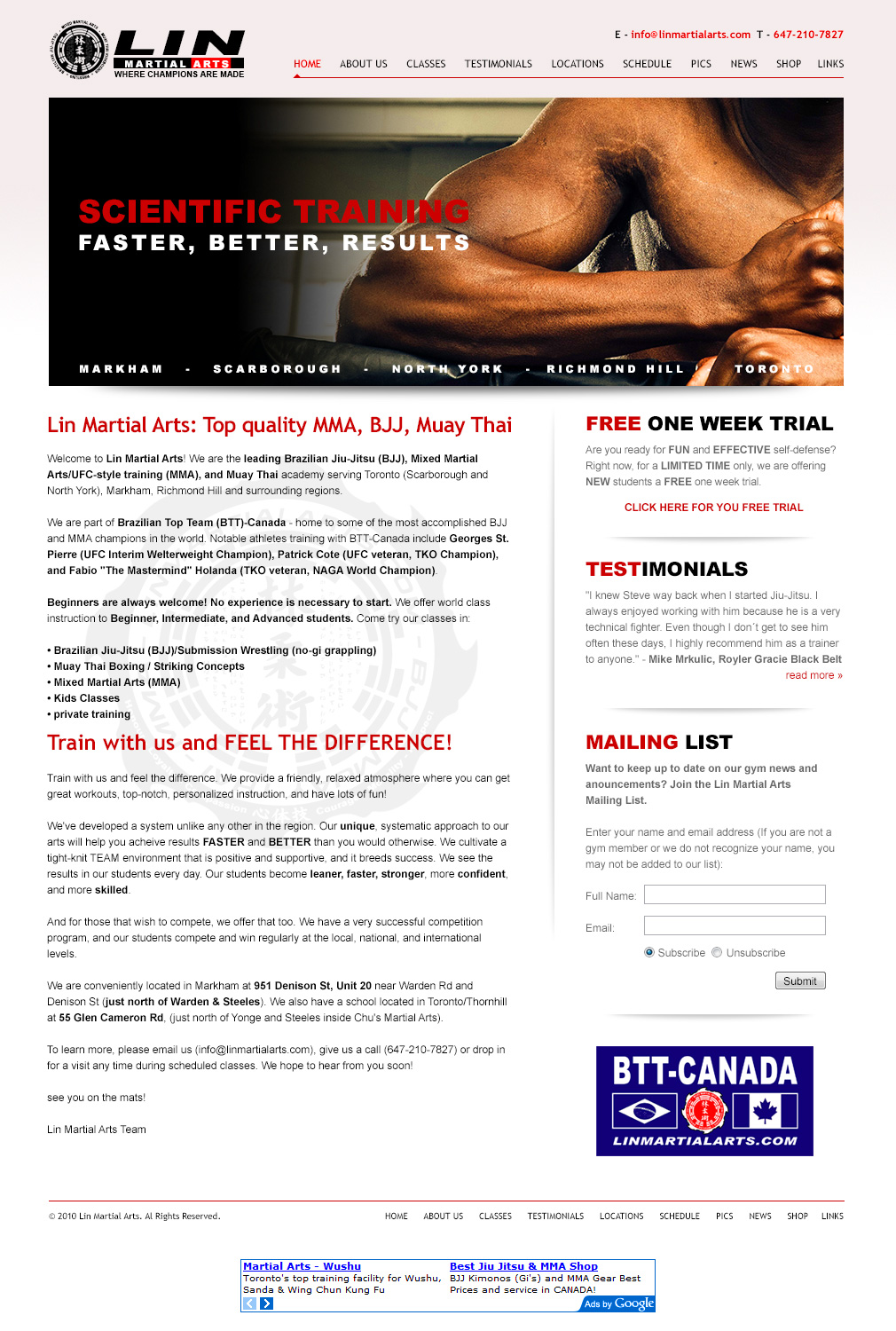
Home Page (Desktop)

Home Page (Mobile)

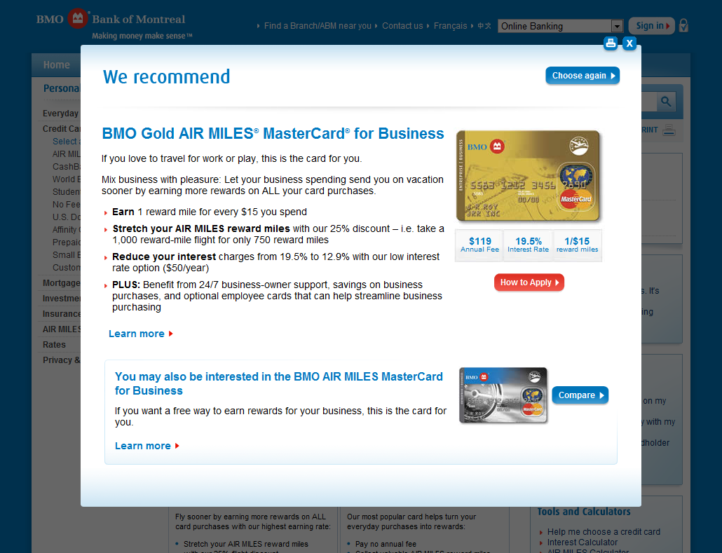
Visualizer (Desktop)

Visualizer (Mobile)

Profile (Desktop)

Profile (Mobile)
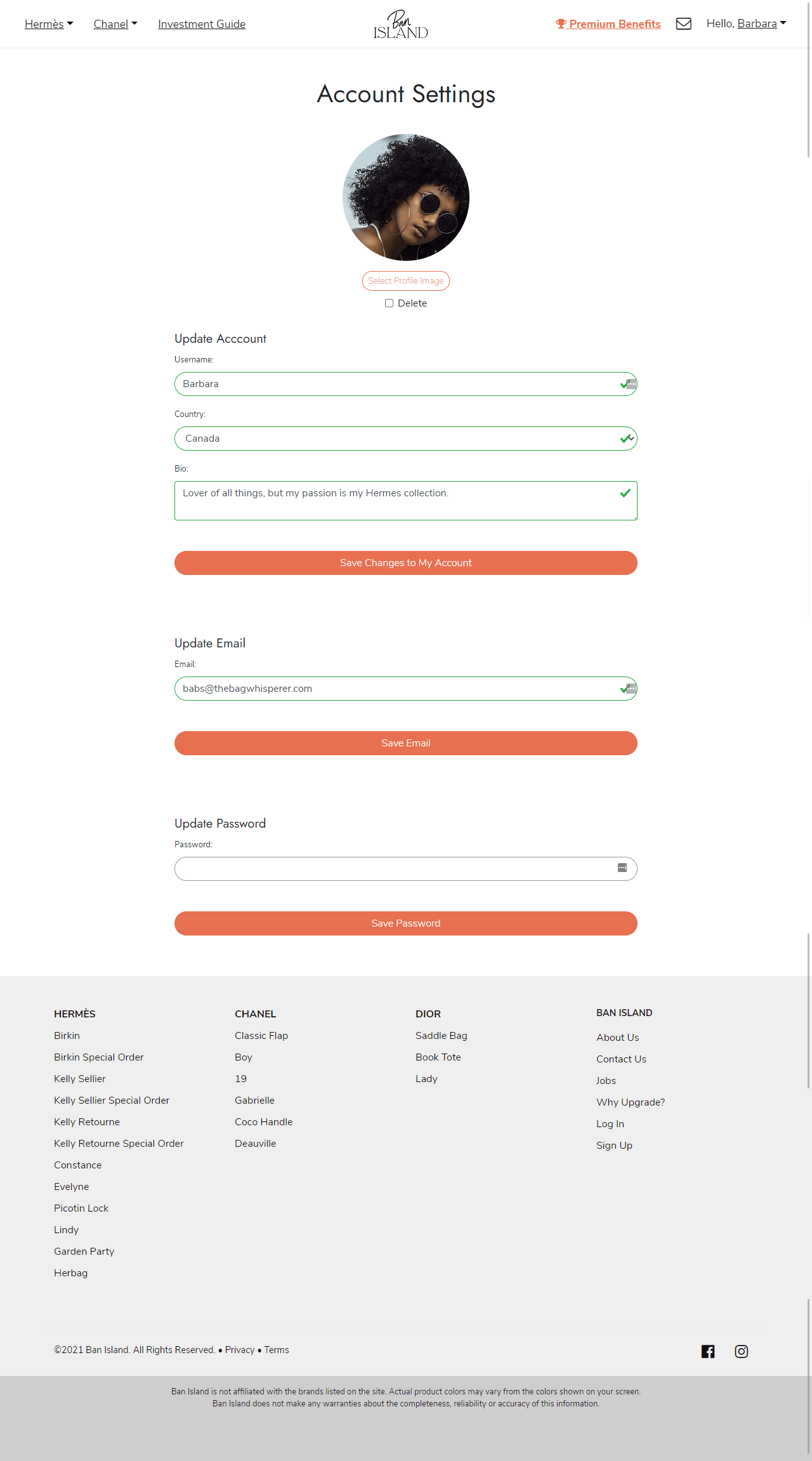
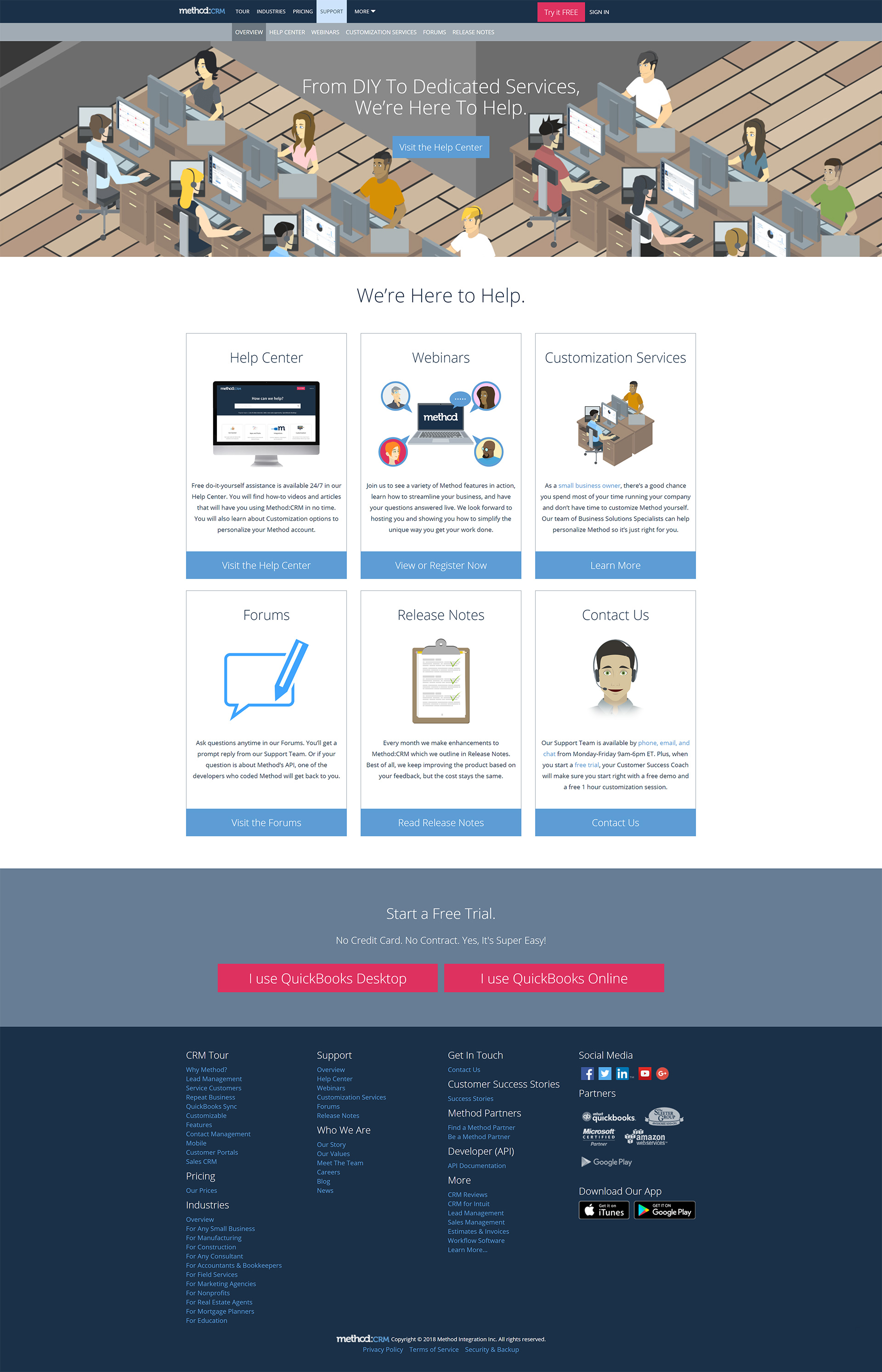
Account Settings (Desktop)

Account Settings (Mobile)

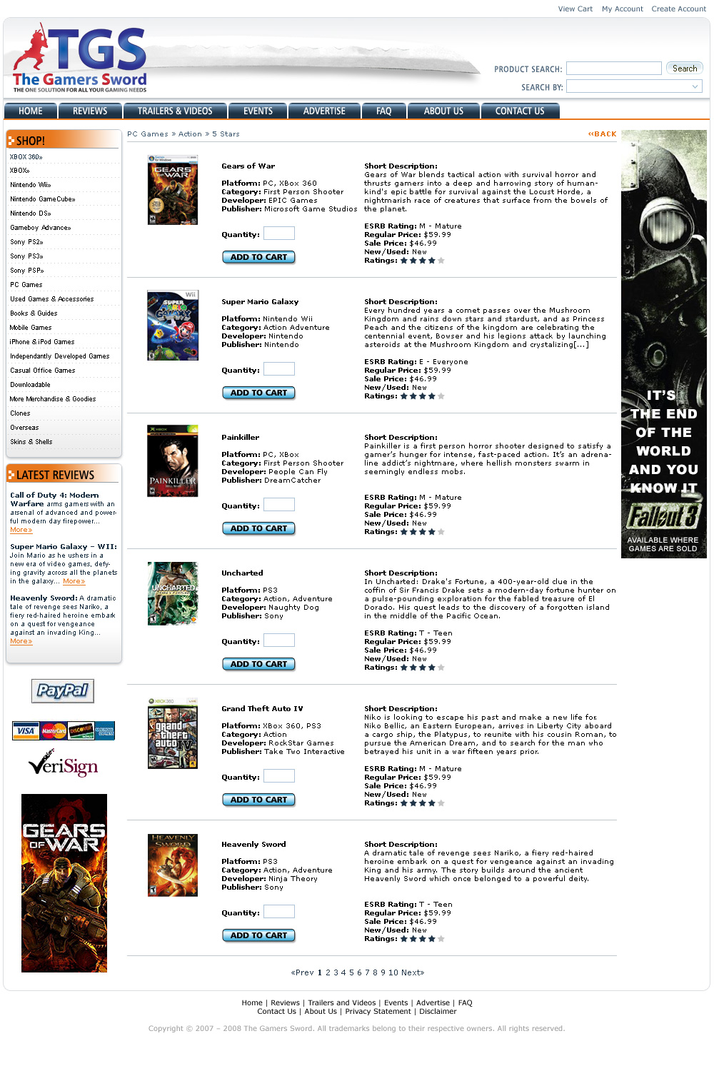
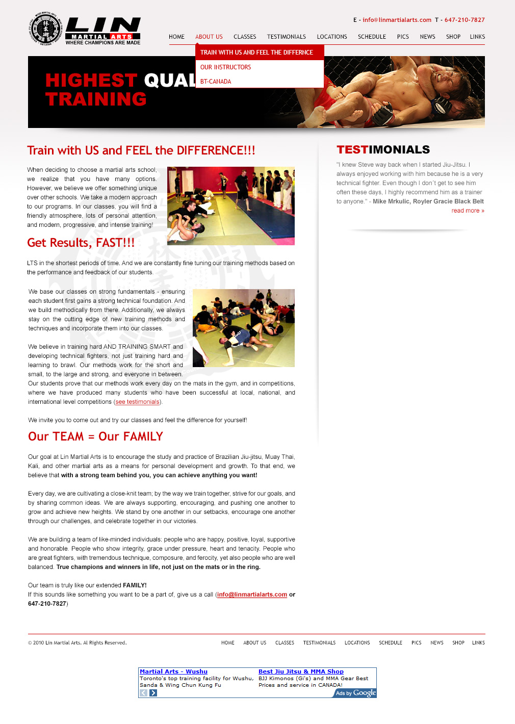
Brand Page (Desktop)

Brand Page (Mobile)
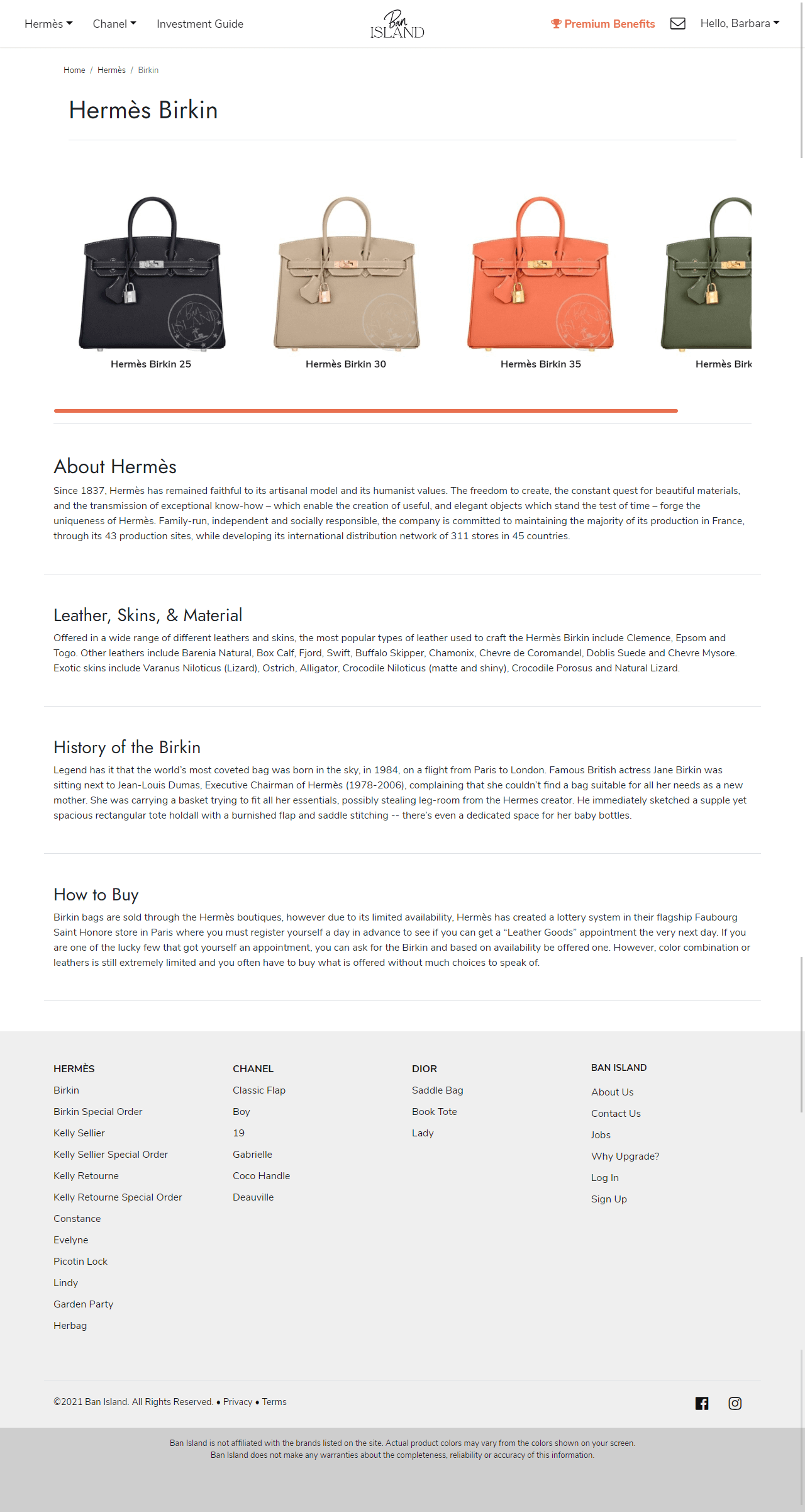
Brand Product Page (Desktop)

Brand Product Page (Mobile)
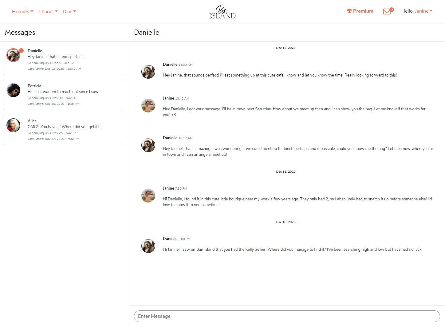
Messaging (Desktop)
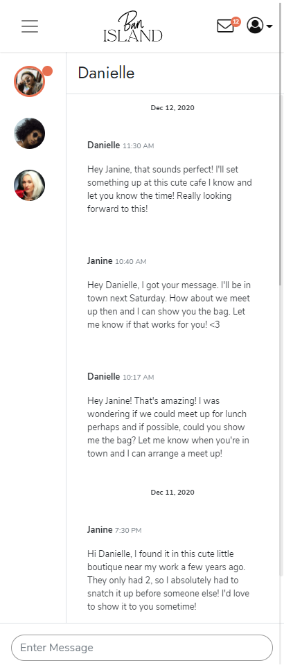
Messaging (Mobile)
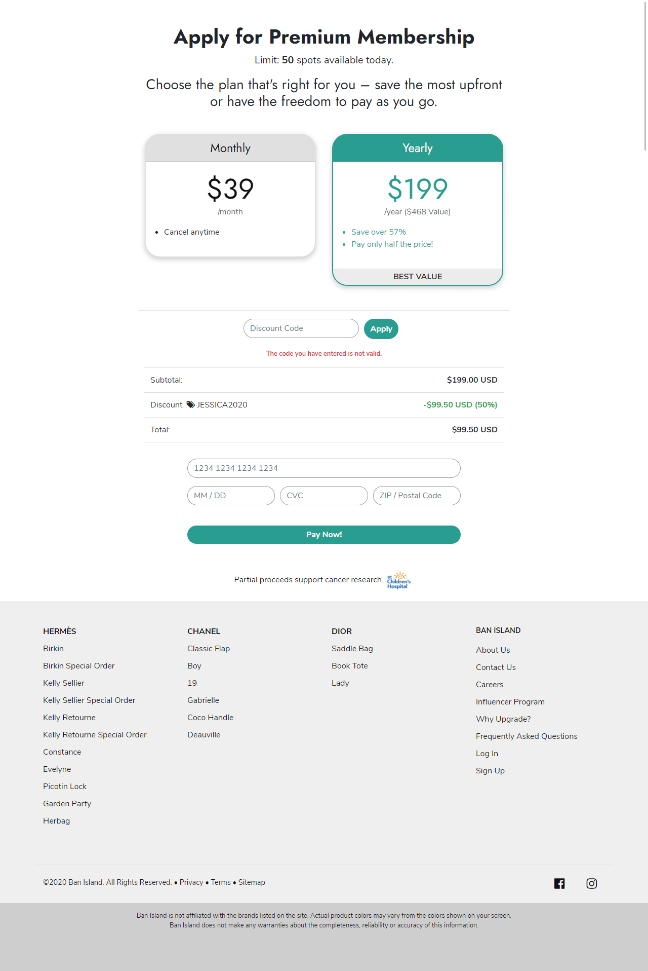
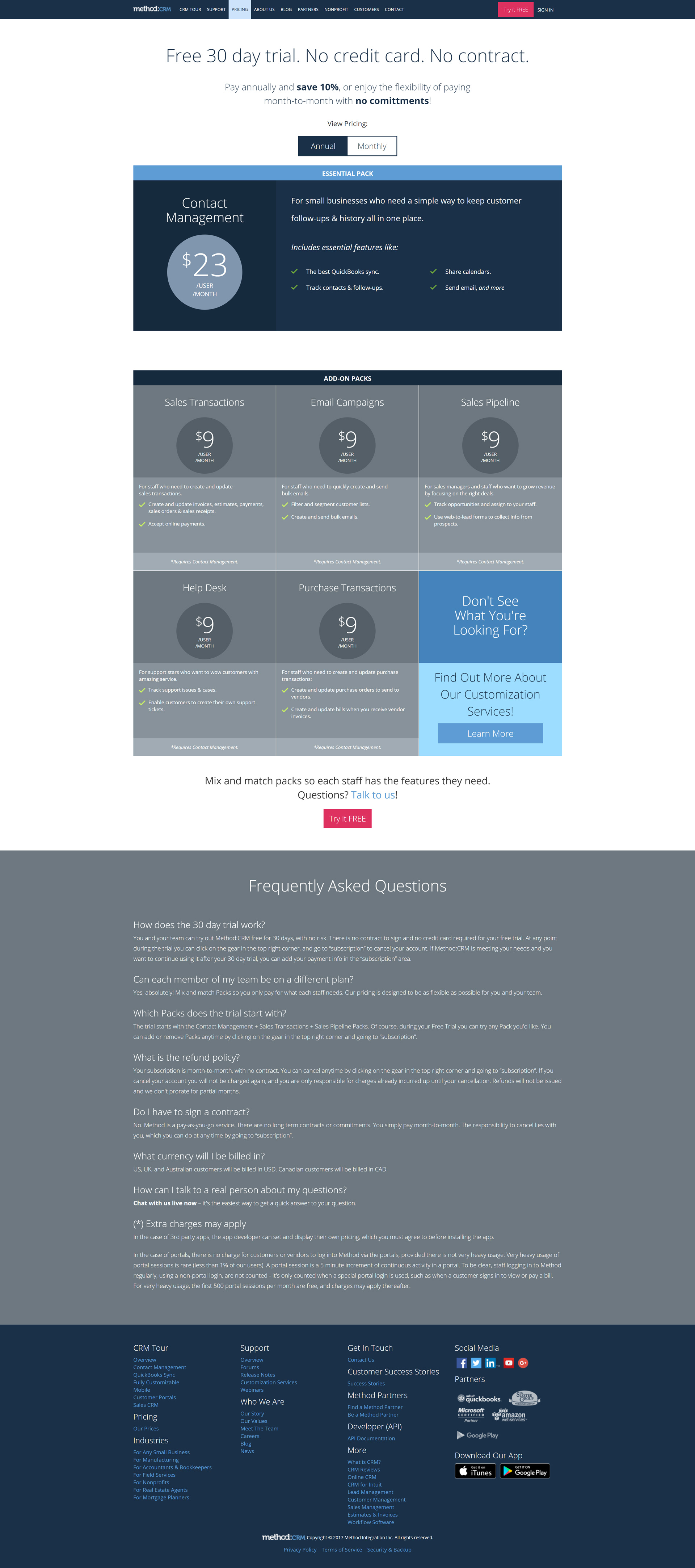
Payment (Desktop)
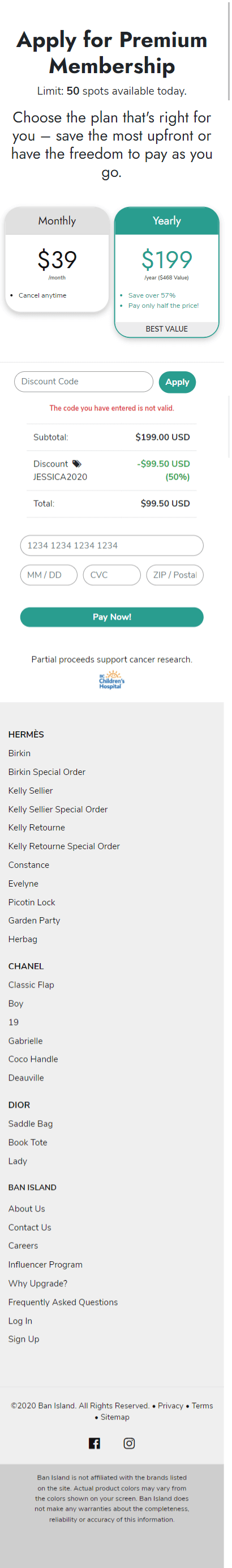
Payment (Mobile)